Core Construction began as a general works contractor in 1995. Over the years, the group has undertaken many challenging projects and accumulated skills, know-how and experiences in design and build solutions, project management services, building trades and related engineering works.
Core Construction
Brand Identity, Web Design
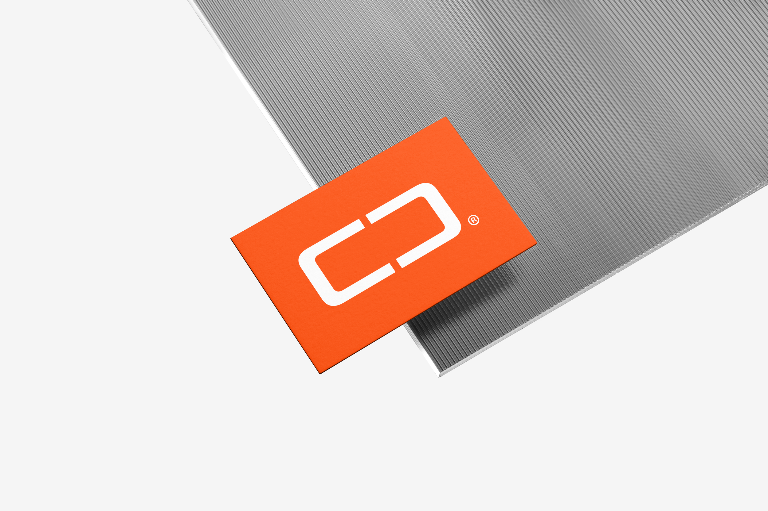

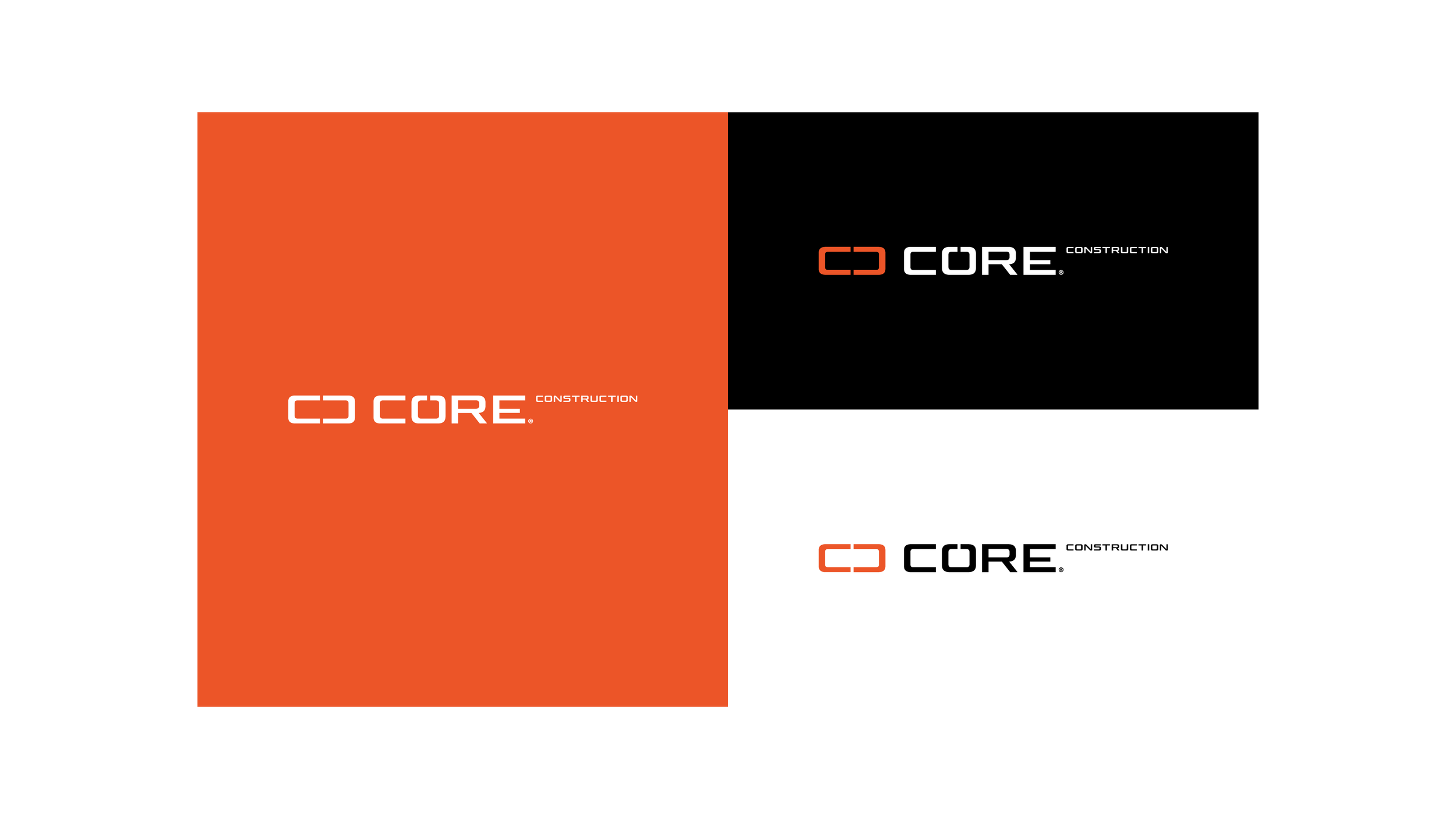

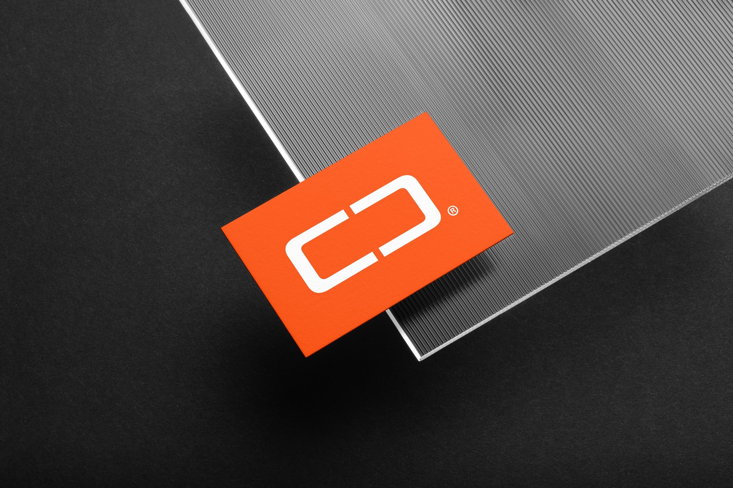
Utilizing two letter C’s which face each other, the monogram creates a clean, simple structure which can denote various artifacts and construction processes. The cut out between both letters can align with a section view of bored piles resulting in a similar profiled centre shaft of negative space. This creates a core between each letter, which is a crucial part of their foundation in both principle and in the construction process.
Construction
Logo Construction
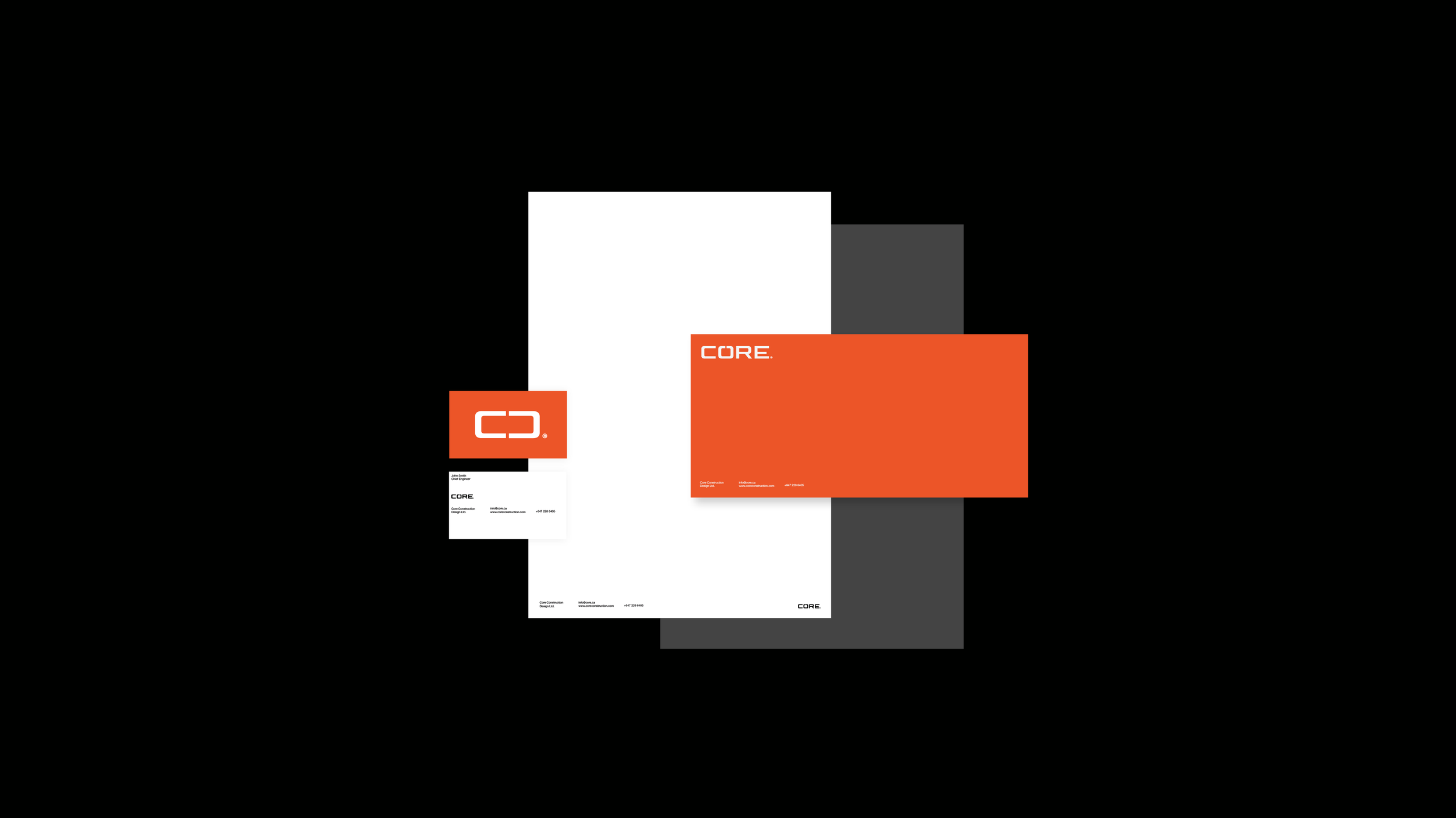
Using environmental artifacts and hues of construction sites. This color scheme is designed to reflect innovation and optimism. The bright orange invites you to take notice, while representing bright sparks from every important weld. A high contrasting black to signify power and importance, along with tones of grey to speak for the large volumes of concrete and aggregate.
Color Scheme
Primary:
Secondary:
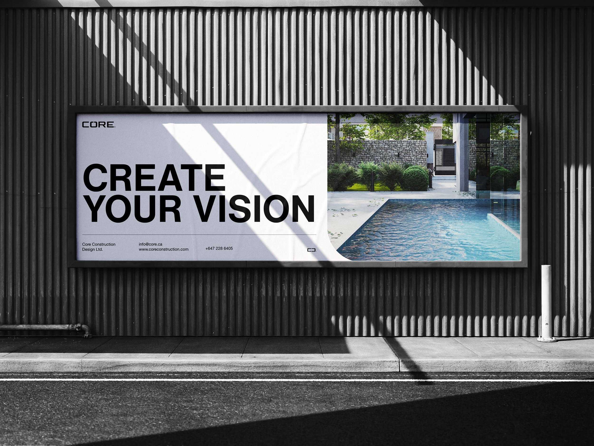



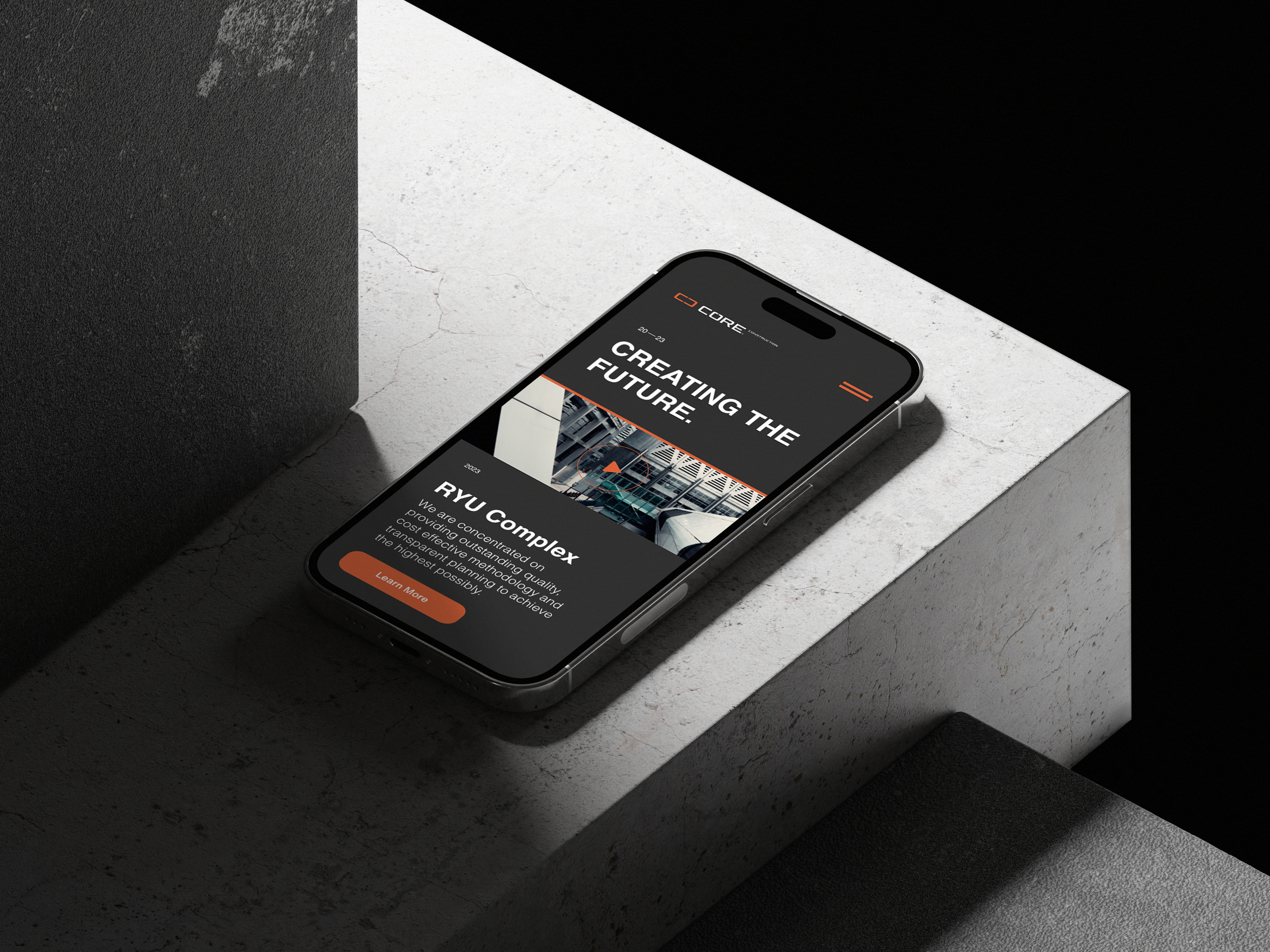


This website design is a combination of different elements that work together to create an effective and user-friendly experience which successfully aligns with the brand guidelines.
Website/ UI UX Design


